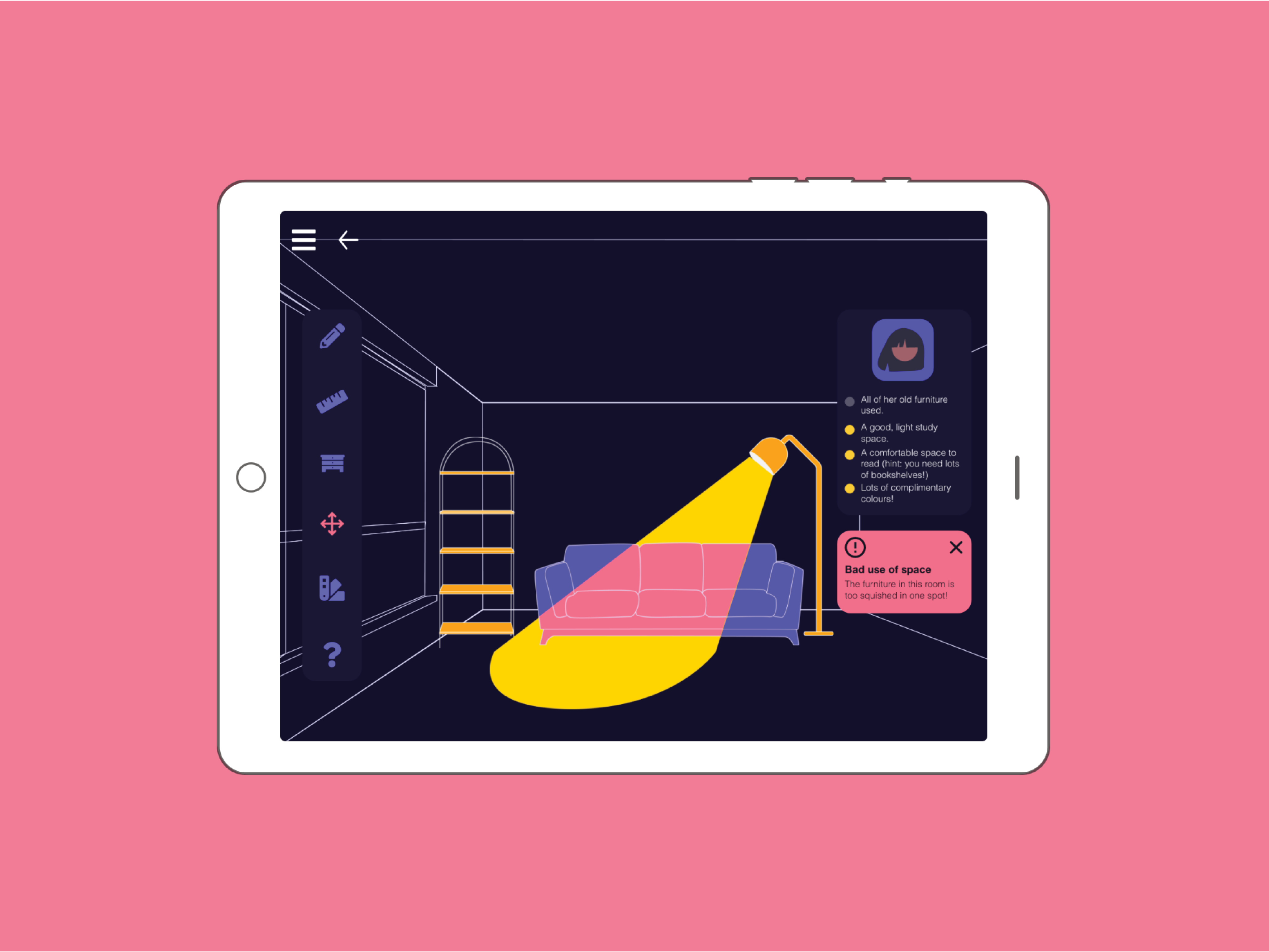
Duration: 4 months | Methods: UX Research, Prototyping, Usability Testing | Tools: Figma, Adobe Illustrator | Team Size: 6
Problem Space:
With ongoing issues surrounding COVID-19 and the continual cycle of school closure in Ontario over the past two years, discussion surrounding the opportunities and limitations of online classroom formats has become increasingly important. As students ourselves, we experienced the isolation and boredom induced by Zoom and Google Classroom firsthand. Therefore, we wanted to create an online learning platform that addressed lack of engagement and extrinsic motivation in high school students under online classroom formats. In particular, participation and involvement of students in online school activities such as projects, lectures, and group work.
User Research:
To better understand the needs of our primary users, we used the snowball sampling method to recruit 32 survey participants (comprised of 12 students, 10 teachers and 10 instructors) and 6 interview participants. We found that although students felt positively about certain aspects of online learning (reduced commute time, flexible scheduling, reduced hours), 83.3% of students preferred in-person class.
The primary factors we identified were:
• Social isolation: Students cited in-person interaction with peers (hanging out with friends and interactions in a physical classroom) as being the thing they missed the most with online school.
• Lack of engagement: 100% of participants thought online learning increased time wasting in class, with the top forms of distraction being social media, texting and catching up on homework for a different class.
• Lack of teacher support: Students and parents overall felt negatively about the school's and teachers' support of students.
“It seemed as though once things went online-only, the people in charge from the teachers upward all abdicated responsibility”.
“Even though we could send a DM [Direct Message] to teachers, I didn’t think they would answer or they’d be very hit or miss when I did”.
Research Analysis:
From our formative research, we created design specifications for development of the low-fidelity prototype.
Design specifications:
Social: Cultivate comfortable, enjoyable interactions and collaborations between users.
Engaging: Provide a fun environment for students to meaningfully engage with class material.
Accessible: Should be intuitive and usable for a wide range of users.
To further identify priorities and potential user pain points for our product, we created two key user personas and an experience map.
User Personas
Experience Map
Low-fi Prototype:
As a team, we individually brainstormed and created low fidelity prototypes, before creating a combined prototype we could internally evaluate and iterate upon.
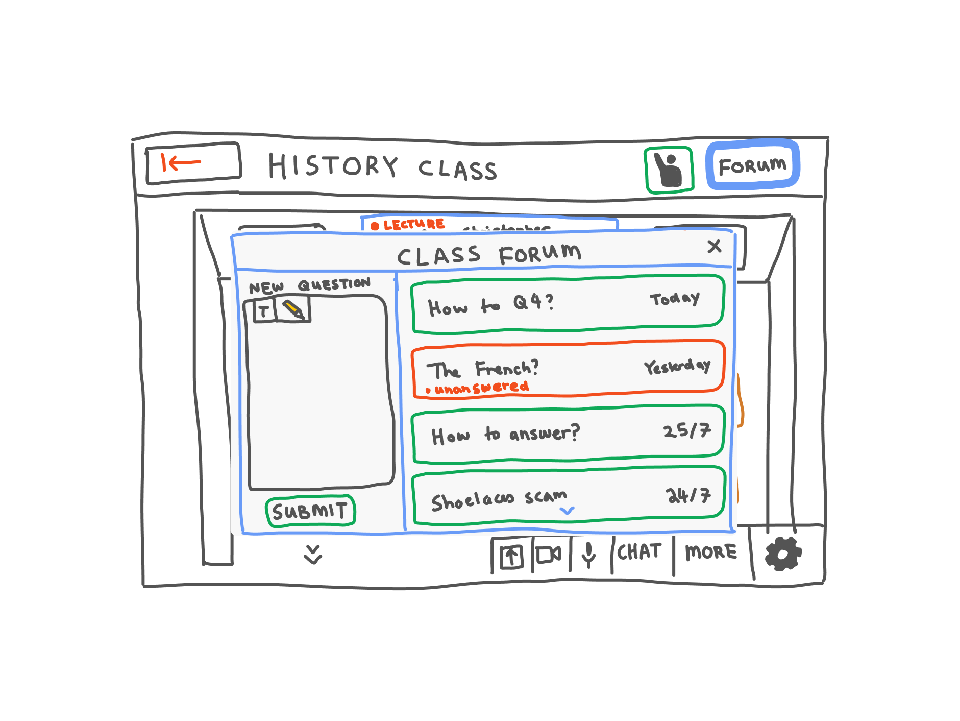
Forum page
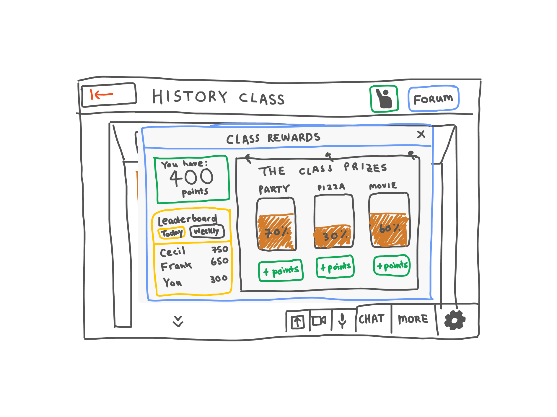
Class rewards
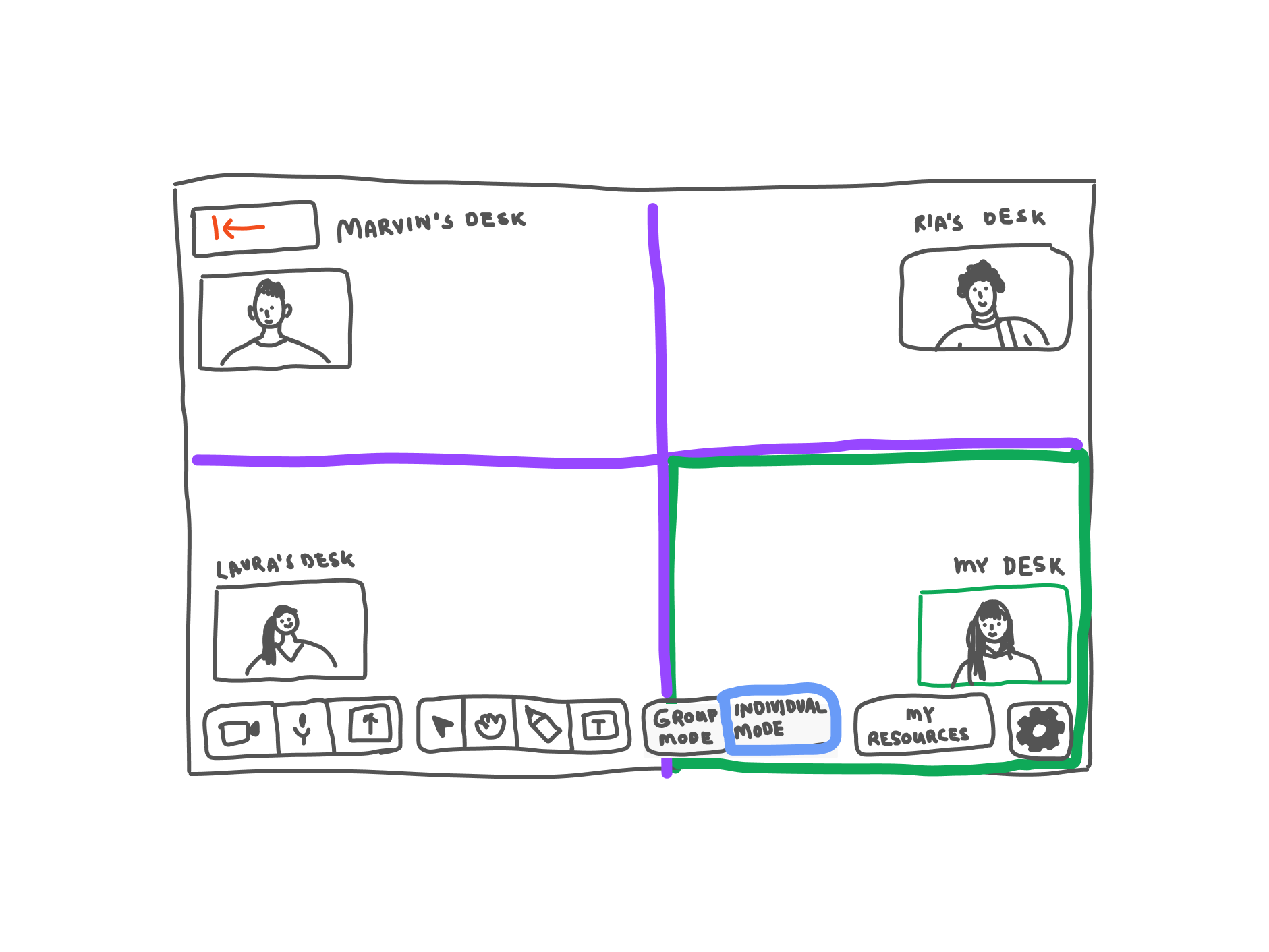
Collaborative Desks
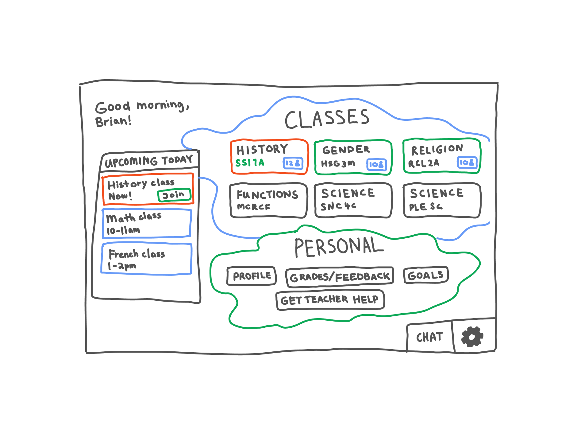
Home page
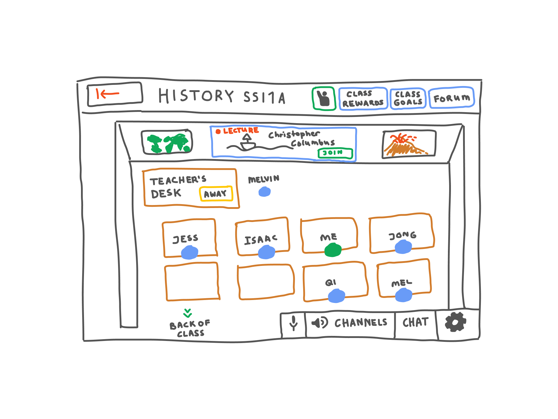
Classroom page
Heuristic Evaluation:
Along with a cognitive walkthrough, to identify usability issues, we conducted an internal heuristic evaluation.
We discovered that feature organization was unintuitive (e.g. grouping of features under “more” made them inaccessible), and app statuses weren't evident, in violation of Nielsen’s first usability heuristic, “visibility of system status”.
Excerpt from the heuristic evaluation table.
Iteration
After gaining additional feedback through an in-class usability test, we made key changes to our design and created another set of low-fidelity designs.
Solution
Creating nurturing virtual spaces
Insight: Students found it hard to reach out to teacher and peers. They found classes held on Zoom and Google Meet, with most students with cameras and microphones off, impersonal and isolating.
Solution: A virtual classroom space that imitates aesthetic and function of physical classrooms grounds students in a familiar, intuitive space. This space hosts different collaborative tools (e.g. line-up at the teacher's desk and collaborative peer-based "desk space") that enable students to connect and seek support.
Classroom Page
Lining up at the teacher's desk
Recentering collaboration
Insight: Students found tools used by teachers, such as Zoom and Google Classroom, boring and lonely. Students would sit in silent breakout rooms and disengage from classwork.
Solution: Using greater physical classroom metaphor, "desk spaces" are multimedia collaborative spaces, allow students to work and collaborate side by side.
Desk space page
Group table page
Fully integrated for efficiency
Insight: Because schools didn't standardize tools used for online class, students continually had to switch tools throughout the day, which was stressful and inefficient.
Solution: Fully integrated solution that provides all the features students require to succeed, including a class organization tool, lecture space, and goal setting tool.
Setting a private goal
Lecture page and bottom navigation
Encouraging engagement with gamification
Insight: Based on literature review of “Does gamification increase engagement with online programs? A systematic review” by Jemma Looyestyn et al, we found gamification, specifically leaderboards, was an effective way to increase engagement. And, as mentioned, student engagement is one of the largest issues with online school.
Solution: Gamified point system where students earn points for completed class tasks and can track their progress using class leaderboard. Students then use points to contribute to class goals that classmates work towards together.
Completing a class goal
Usability Testing:
We conducted 10 online usability tests with students, with 14 different usability tasks. 40% of the usability tests were conducted with Grade 12 students, and 60% were conducted with first-year university students.
As the task success rate graph suggests, task success rate was overall high, with a handful of tests (i.e. Task 8 and 13a) performing poorly. Based on most failed tasks, we identified both key design issues with our prototype (e.g. ambiguity of the volume panel) and poor usability testing practices (i.e. the use of leading questions) to improve upon.
Task Success Rate Graph
Outcome:
As a part of our course, we presented our design to a panel of UX design professionals and came 2nd place in a class of 30 presenting teams. Moving forward, the primary goal for the Berdhouse project is to design the corresponding back-end experience for instructors.
View our final presentation here.
